How “Color of the Year” is Smeared in Peoples’ Lives
June 12, 2020 by Soohyun Moon
Every December since 2000, Pantone Color Institute, a leading color company dedicated to supporting the management of color in various industries, has been selecting the “Color of the Year” for the upcoming new year. Twice a year, Pantone hosts a meeting with various color standard groups from all over the world for their color selection. They do not pick a color that simply differs from the past year’s. In fact, they go through a rather thorough process in picking the color that would best express the social snapshot of the new year and forecast global color trends. The teams gather and spend the entire summer and fall months analyzing fashion shows, the art industry, and social media to gather evidence on colors that are trending. It must be remembered that they are not only looking for a trendy color but also the color that implies a message for the following year.
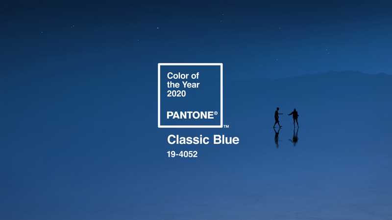
Classic Blue was selected as the Color of the Year 2020. Living in a world where technology and science keep developing and as a result, everything seems so busy, blue was considered the best in posing this issue as it represents communication and introspection. The meaning of this color gives us a sense of tranquility and the opportunity to look back on ourselves. "A boundless blue evocative of the vast and infinite evening sky, Pantone 19-4052 Classic Blue encourages us to look beyond the obvious to expand our thinking; challenging us to think more deeply, increase our perspective and open the flow of communication." said Leatrice Eiseman, executive director of Pantone Color Institute.
In terms of the practical usage of this annual color selection, the “Color of the Year” is frequently used in various markets across industries, such as in fashion, cosmetics, food and beverages etc. Pantone contracts with numerous different brands on their partnership every year, and their collaborations create a huge synergy in terms of utilizing fresh marketing techniques and showing consumers that they are on trend. In 2020 for Classic Blue, Pantone has made partnerships with Adobe Stock, FedEx, VDL, Copenhagen Design, LOKAI and many more. While in partnership, these brands create products that are usually launched as special editions with the Color of the Year.
One of the most successful cases of such partnerships was with Sephora in 2016, whose color was Rose Quartz & Serenity. The collection SEPHORA + PANTONE UNIVERSE includes a 24-color eyes palette, a matte lipstick in each color and a 5-piece lip gloss set. Sephora worked with Pantone to broadly compose the palette of complementary colors with Serenity and Rose Quartz being the main shade. For the lipstick with the color Serenity (a type of light blue), they were initially skeptical of its launch since it is not a conventional lipstick color. Yet, it saw a great response from consumers along with their perceptions that the color is in vogue. Like this case, many marketers seek collaboration with Pantone and their Color of the Year to replicate a similarly successful synergy. After the next Color of the Year is announced, it will not be too difficult to look for brands with that color at the department store in 2021.
Now, for us as college students, there are a lot of times when we find ourselves having to make PowerPoint (PPT) slides and present with them. Since this activity is ultimately aiming for conveying what we want to say to the audience, it is essential to capture their attention from the very beginning so that they can gradually concentrate on our talk. Let’s admit: we all had that moment thinking long and hard about deciding our PPT template. It should be readable, catchy, and include some artistic vibes. Imagine importing a default white background or a random character template. The PPT would then either be too dull or too messy. How about embellishing your slides with the Color of the Year? Here, I recommend using a mixture of two or three colors that go well with each other. Color harmonies can be found on the Pantone website and they kindly tell us five different preloaded color palettes, composed of up to eight colors for each Color of the Year. Since using all the palette colors for the template would actually scatter our focus, picking only two to three would be enough. Applying those selected colors onto our PPT would greatly enhance your delivery, especially when also including pictures and online resources that display similar color schemes.
The Color of the Year is practically being utilized by countless different people and sectors of the community. Yet it is important to not detract from the hopeful messages the colors imply and get a sense of restfulness and encouragement for the upcoming year. Amidst the whole COVID-19 situation the world is facing now, I begin to wonder which color and what kinds of messages will be presented by Pantone this December. Even though the color itself would not be able to reverse the situation at once, the message by which it will accompany will strive to keep the world motivated in overcoming the situation with a positive and hopeful mindset. So why don’t we stay tuned for the “Color of the Year 2021” and anticipate a colorful new beginning?
